The Department of the Interior
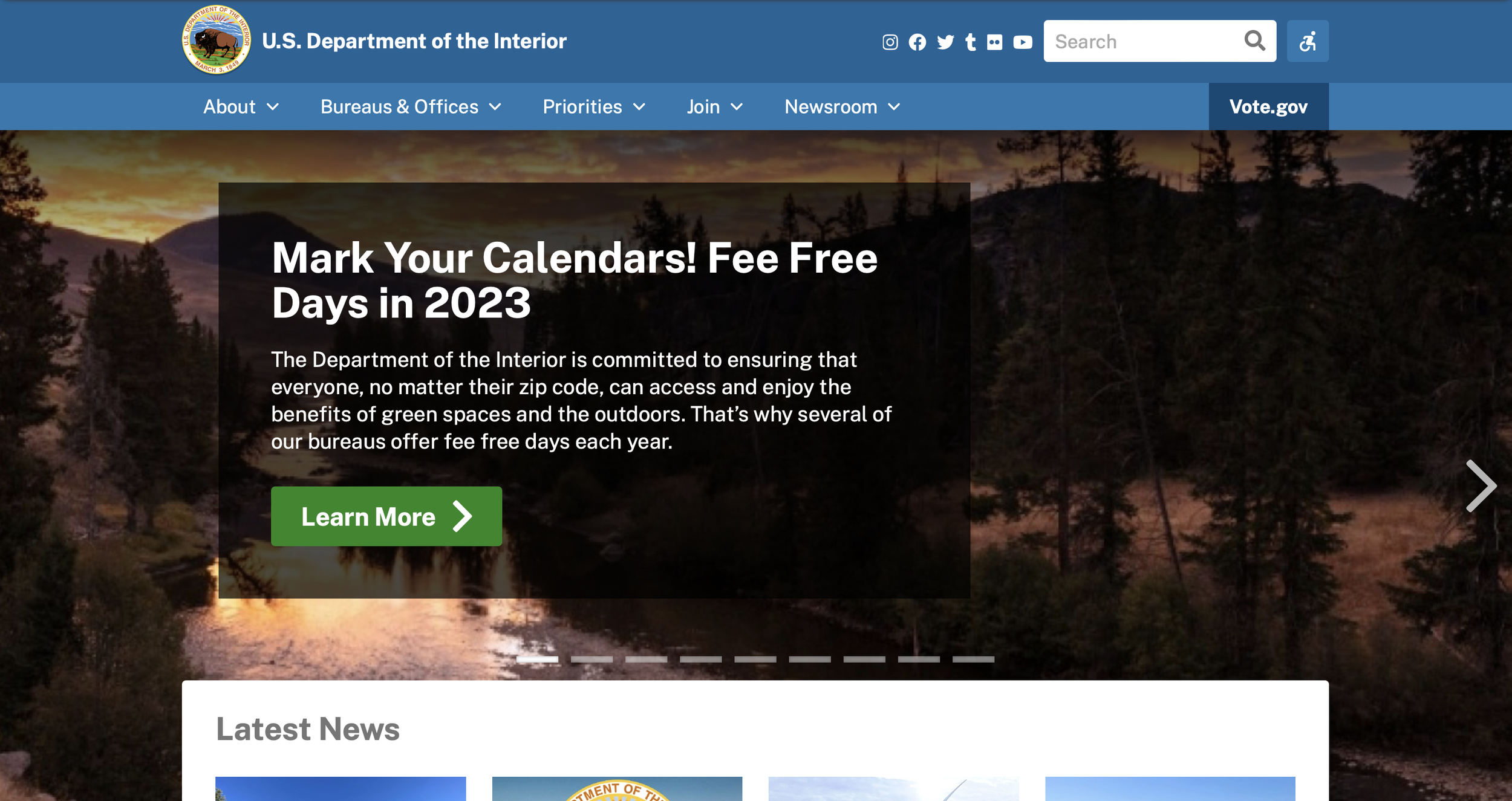
The Department of the interior website, at the time the project was started, was rife with inconsistencies and a color scheme that was not conducive to navigation. Tests performed with this website had users express frustration at how they had to rely on the search bar in order to find information, and how some information leading off-site was not clear.
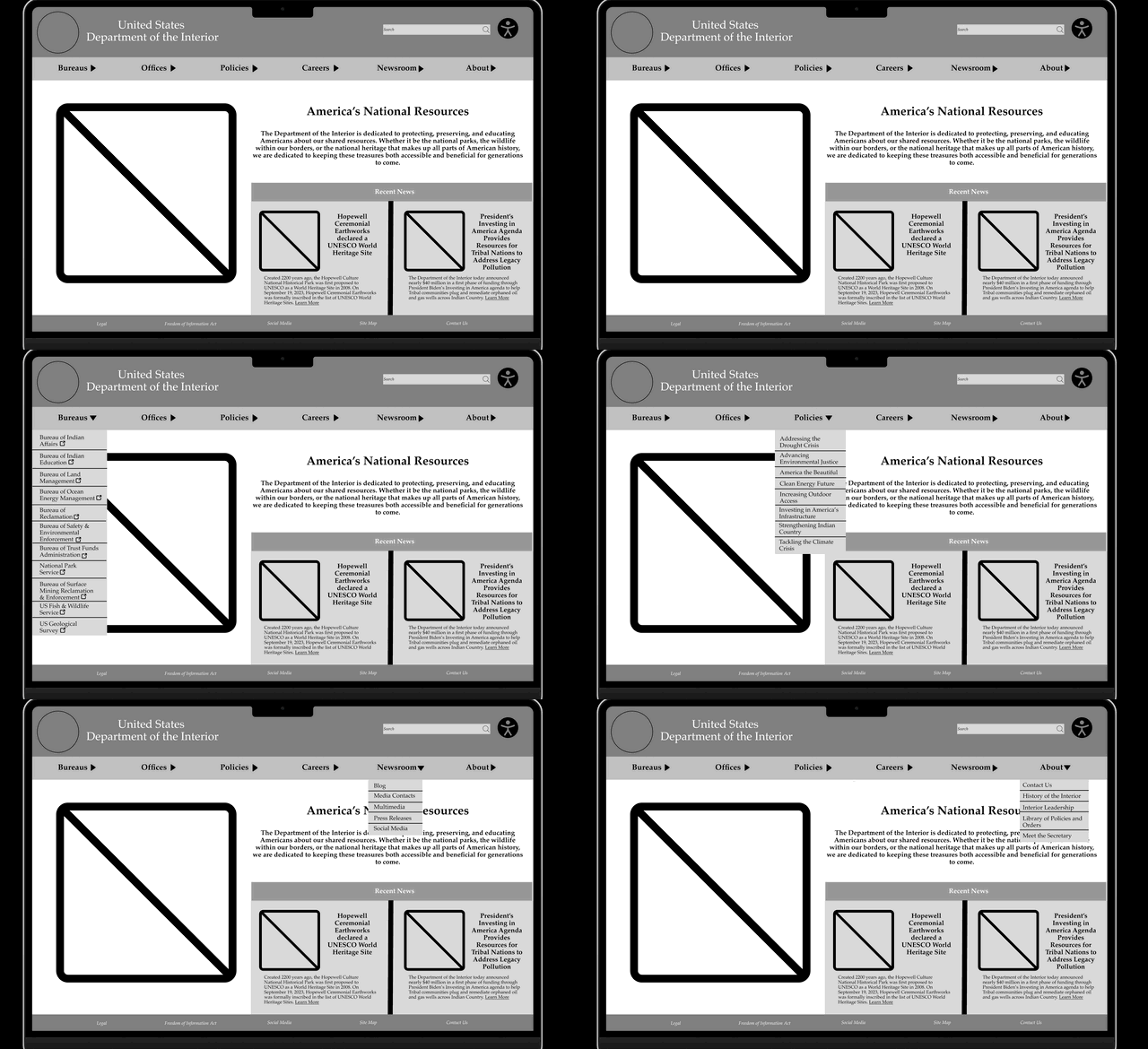
For the LoFi prototype, the color was pulled out of the website in order to reorganize and present the site in a simplified manner.
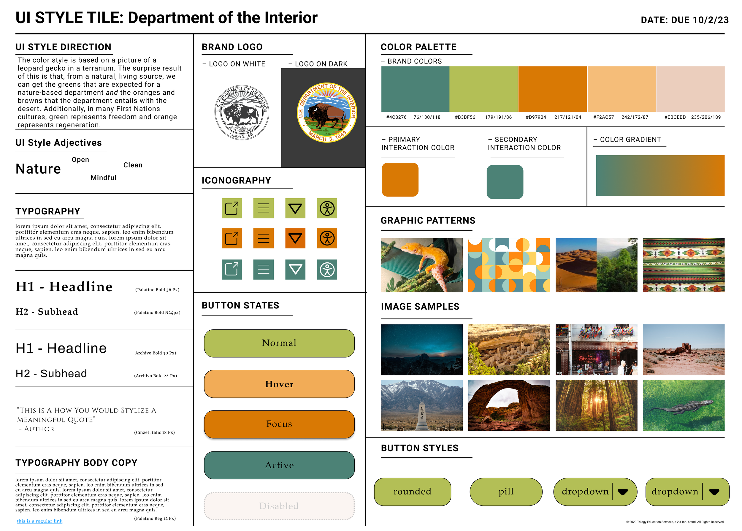
A style guide for the site was then created. The color scheme was inspired by the picture of a leopard gecko, and the focus on oranges and greens was intended to invoke forests and deserts in the mind of the viewer to get the idea of the common heritage that the department aims to preserve.
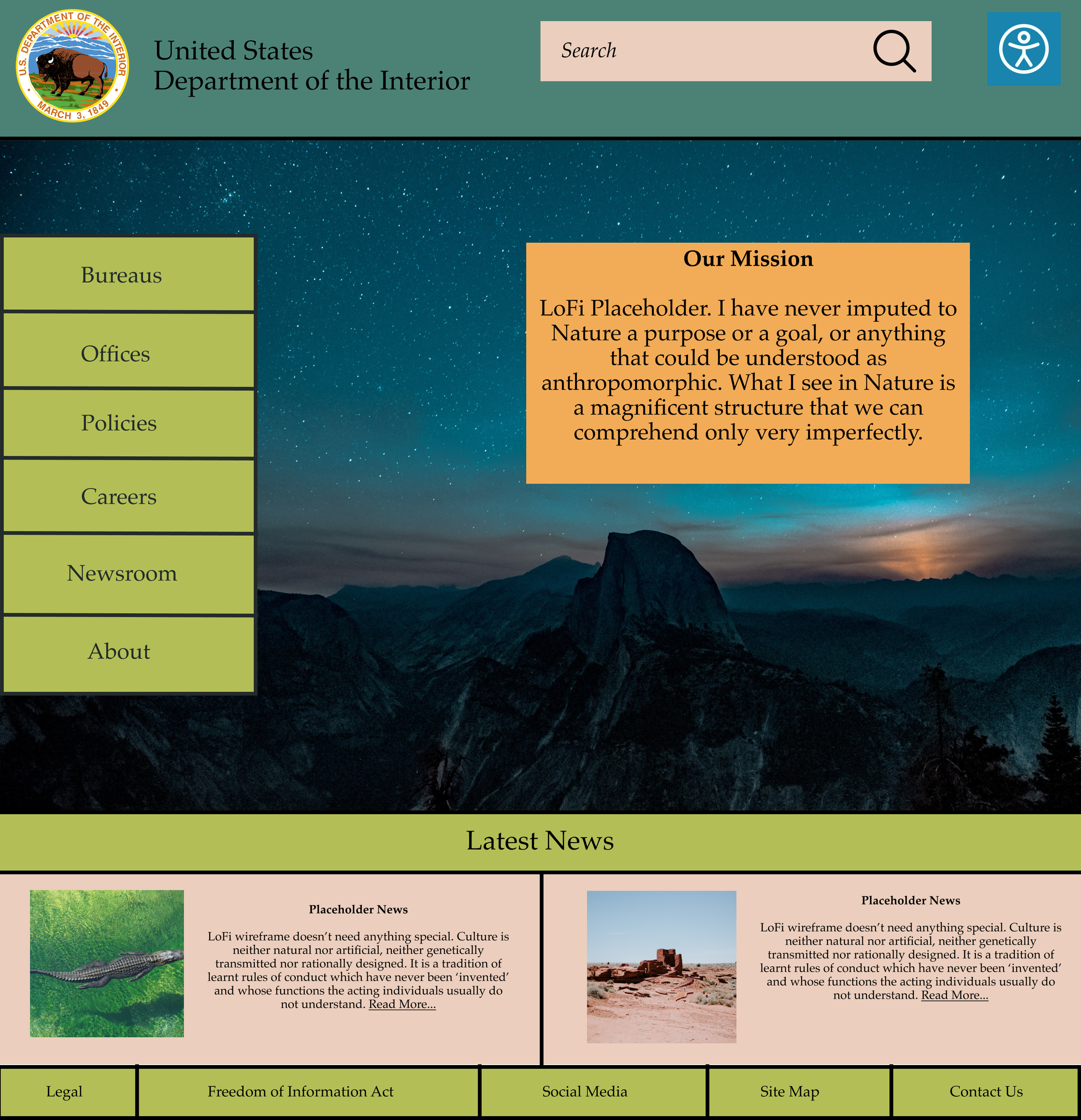
Upon adding the color scheme, some parts of the website were changed in order to create a better workflow on the website. The navigation bar subsections were moved to the side, and the news information was resized to be along the bottom.
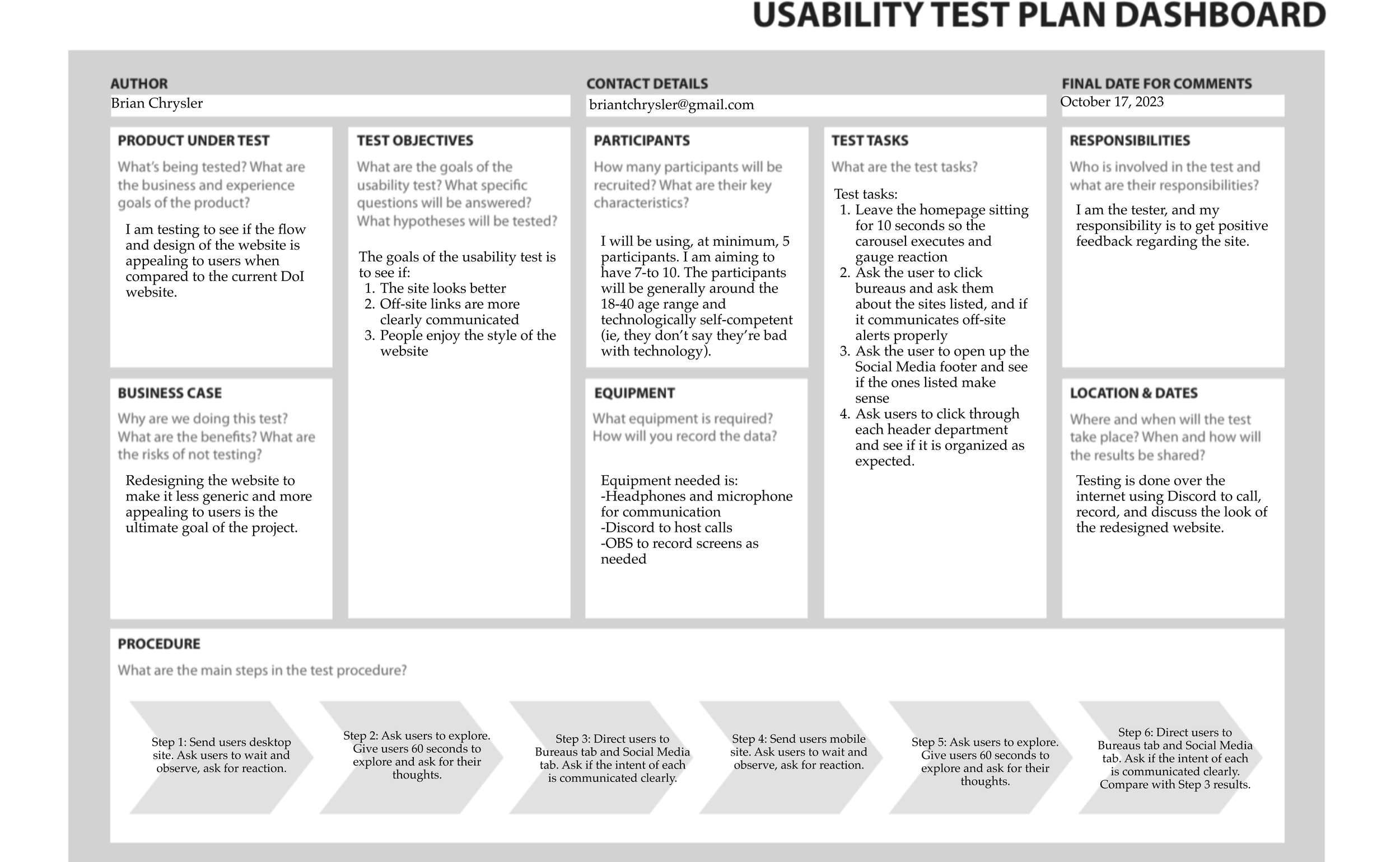
With this, the website was presented to users with a plan designed to gauge reaction. The plan also simplified the tasks, as the website is extremely expansive, and this test was mostly to check on the design.
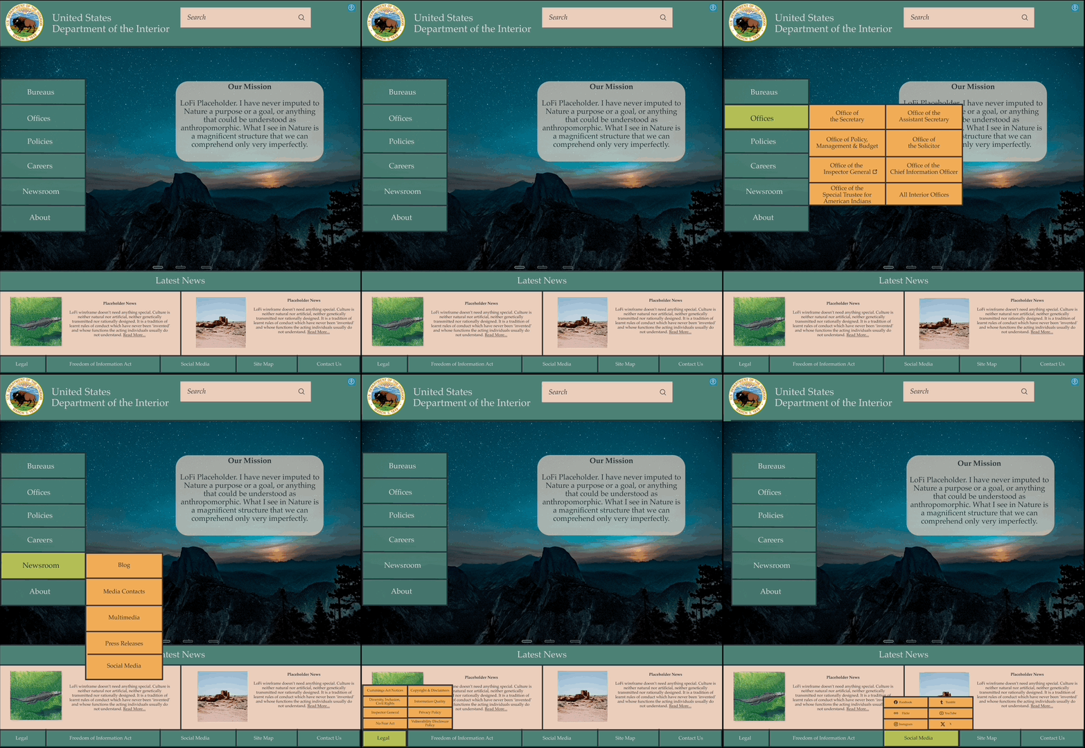
After feedback, segments of the site were changed to make them more readable, resulting in the shown prototype.
